
Smart Home Product Design
Reimagining the Google Nest Thermostat Experience

Role
UX Lead · Project Lead · User Research · UX Design · Prototyping · User Testing
Overview
In the U.S., 14% of households use smart thermostats, and 25% of those us
As the UX Leaders choose Google Nest, making it one of the most widely adopted smart thermostat brands., I led the end-to-end redesign of the 3rd Generation Nest Thermostat scheduling experience, transforming a fragmented and complex system into a more intuitive, premium, and design-forward solution.
Timeline
Sep.2025 - Nov. 2025
Team
Danica Liu
Chance Zhang
Junyan Sun
Tools
Figma, After Effects, Photoshop

Background
The Facts About Google Thermostat

40–70% of Nest Thermostat (3rd Generation) users feel frustrated with scheduling and skip it because the interface is cumbersome.
The Challenge
Redesign a widely adopted smart thermostat within strict hardware constraints, transforming a fragmented scheduling system into a high-end, intuitive experience that feels effortless across both device and app:

2.0" circular display (480×480, 229ppi)
Limited information density

Only three physical inputs, no touch or swipe
Only rotate left, rotate right, press

Fixed hardware
Cannot be altered through software
The Goal
Simplify scheduling logic
Modernize the visual language
Create a cohesive experience across device and APP


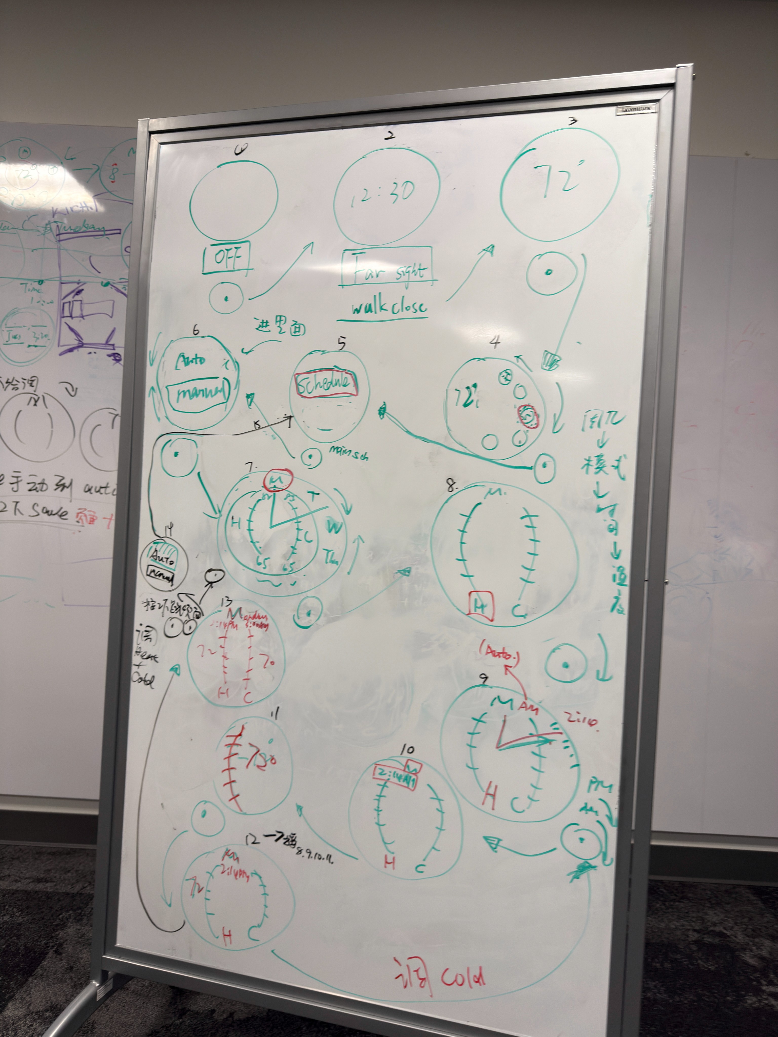
Key Feature
The solution
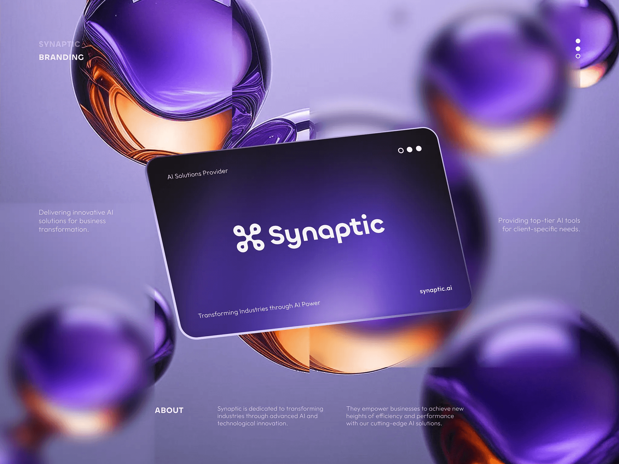
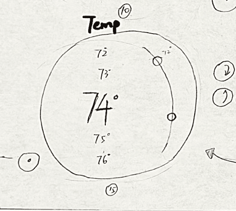
Thermostat
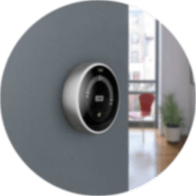
Refined Visual Identity
A refined style appeals to users who seek elegant, distinctive design, delivering a polished and intentional experience.
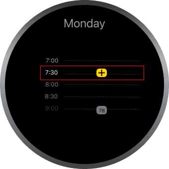
Thermostat
Seamless Control
Users can quickly review schedules and adjust temperatures with ease, supported by clear feedback and low-effort interaction.
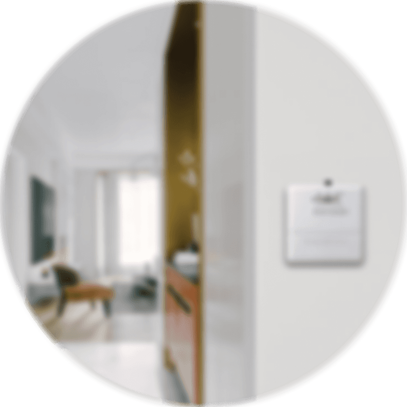
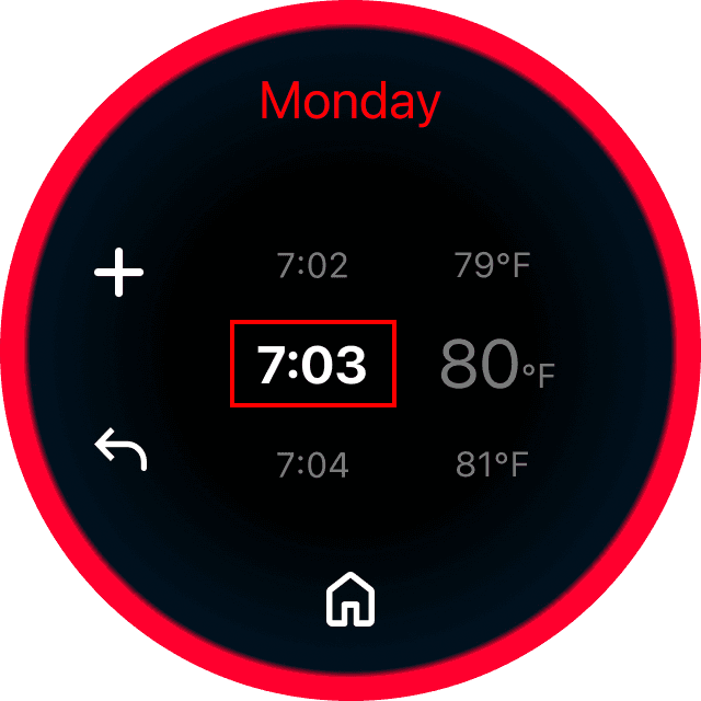
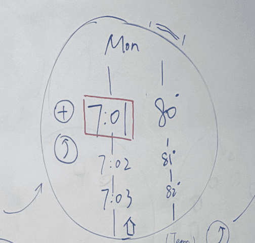
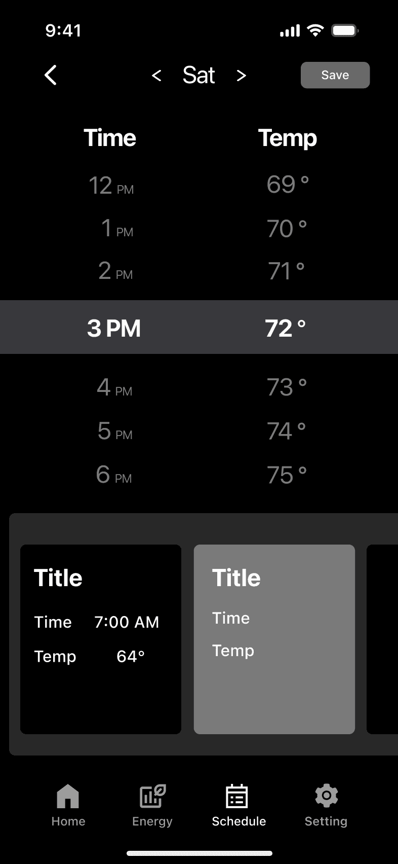
Thermostat
Editable Schedule
Edit and delete actions let users update schedules without rebuilding them.
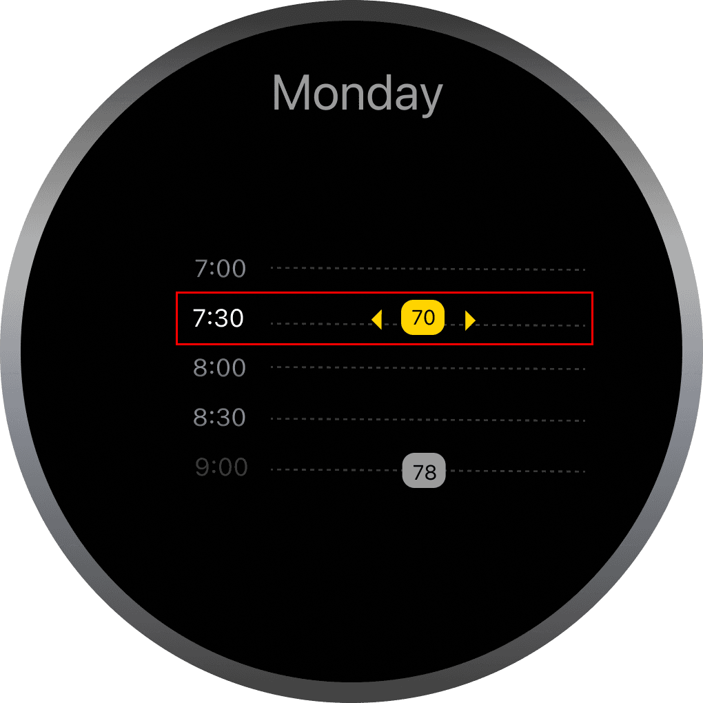
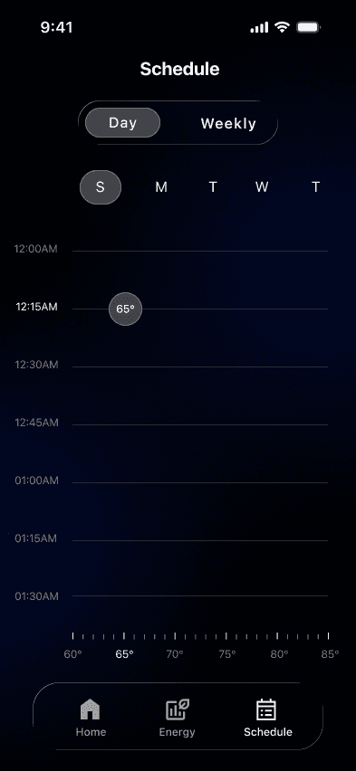
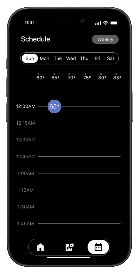
APP
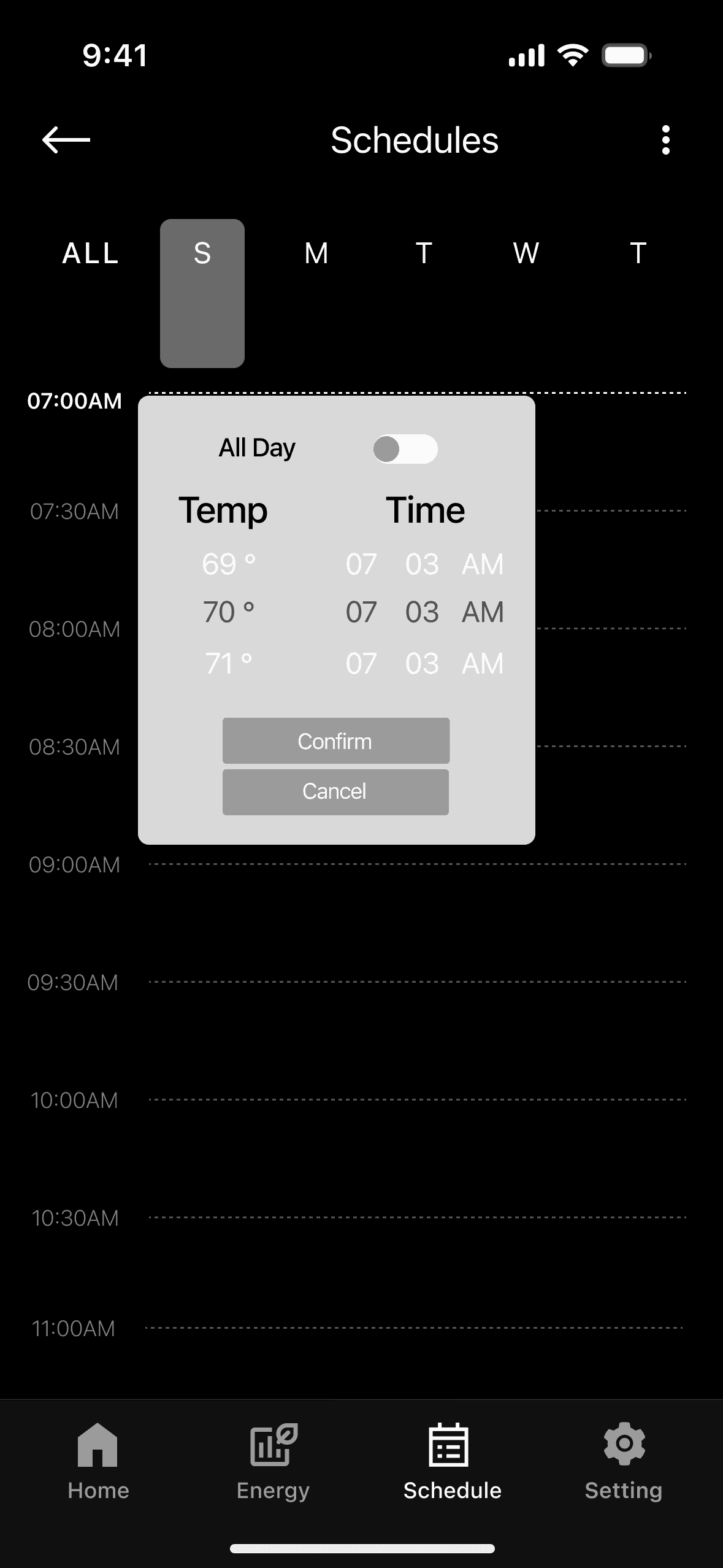
Easy Schedule Editing
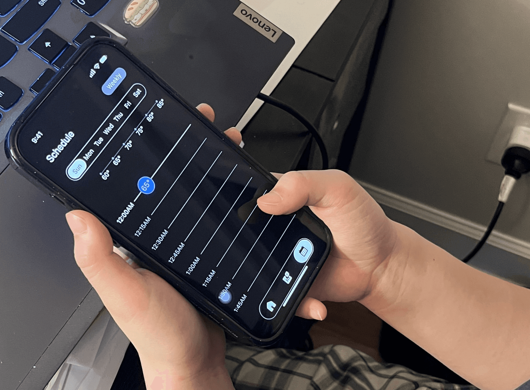
Tap directly on the timeline to place a temperature bubble and drag bubble to adjust.
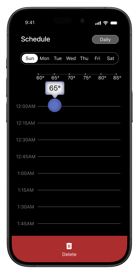
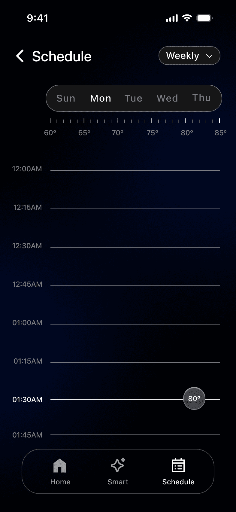
APP
Flexible Schedule Management
Drag the temperature bubble to enter delete mode and remove the entry.
APP
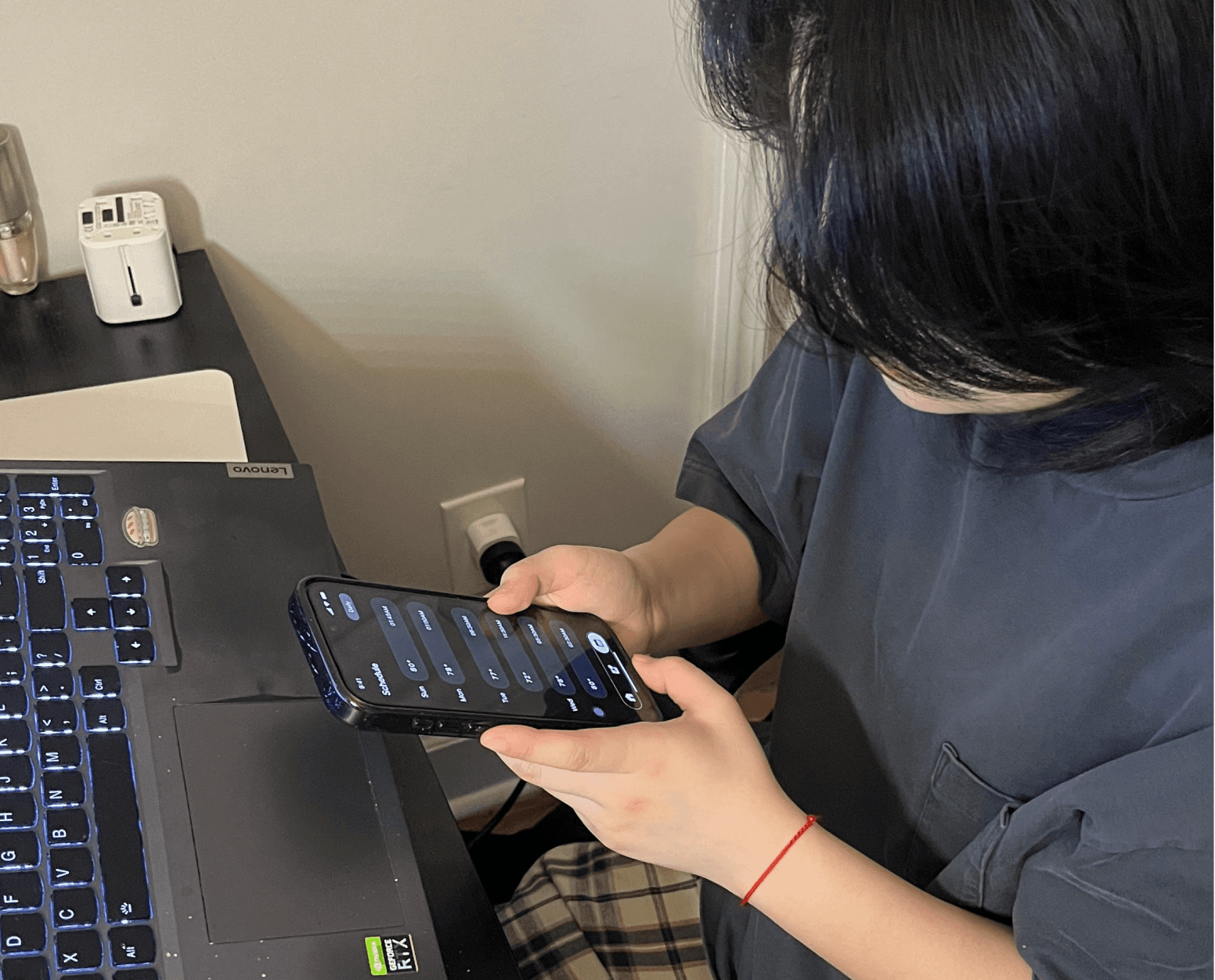
Weekly Schedule Overview
Manage & review all scheduled temperatures and update anytime.
Delivered measurable business impact by improving efficiency, alignment, and decision clarity. Within 10 weeks, a 5-member team contributed 1,150+ hours, generating an estimated $50K+ in UX value.

Team Size
5 Members
Total Hours
1170 hrs


Total Value
$52,650
$32,400
$11,250
Strategy & Decision Making
$9,000
20
20
200
720
250
$45/hr
$45/hr
$45/hr
20
20
72
25
Interaction & System Design
Product Ownership & Delivery
Role
HOURS/WEEK
WEEKS
TOTAL HOURS
HOURLY RATE
TOTAL VALUE
Design Process
Project timeline
Week 01-02
Week 04-05
Week 06
Week 07-08
Week 10
Week 09
Analyze visual identity
Develop Wireframes
Draft & refine concepts
Visual styling & hi-fi prototype
style guide document
Delivery concept
Delivery
Design
Defining
Discovery
Deck Research
Research Finding
Smart thermostats enable automation and efficient climate control, but Nest’s scheduling experience has usability gaps that limit user confidence and engagement.
89%
of programmable thermostat owners rarely or never use scheduling.
— Meier et al., ACEEE (2010)
70%
of users completely skip scheduling features due to usability barriers.
— Consumer Reports


neog23
from reddit
“I don’t even see a schedule button anymore. The app is confusing.”
rednax208
from reddit
“Google Home isn’t intuitive at all. Finding schedule settings is painful.”

chewydickens
from reddit
“I have to tap into each day and drag tiny dots for times/temps, it needs so much patience.”
Market Value
The global smart thermostat market is experiencing rapid growth, driven by:

Smart Home Adoption
Intelligent Climate Control Demand


Connected IoT Ecosystems

Design-Forward Living
2030
2020
2010
2024
$3.5B
<$1B
$4.99B
$13–30B
*Source: Parks Associates, Grand View Research
*Grand View Research — Smart Thermostat Market Size & Forecast
Pros & Cons
Competitive Analysis
I analyzed multiple smart thermostat platforms to understand their strengths, limitations, and scheduling experiences.
The competition lacked both clarity and flexibility
in scheduling simultaneously.

- Clean
- Utilitarian
- Multi-step process
- Hard to preview
- Heavy
- Fragmented
- Weak connection between time and temperature
- Quick access
- UI feels dense
Ecobee
Instant Temperature Adjustment
High-end & Innovative Style
Intuitive Scheduling Flow
Flexible Schedule Editing
Clear Time–Temperature Mapping
Emerson Sensi
- Modern hardware
- simple UI
- Basic mapping
- lacks timeline view
- Smooth touch interaction
- Relatively straightforward

- Easier edits
- Limited logic
Johnson Controls
- Functional
- enterprise-style control
- Industrial aesthetic
- not consumer-focused
- Complex
- technical
- Not designed for frequent changes
- No clear consumer-friendly visualization

Feature

Jason Park
27 years old
“I want to quickly adjust my schedule and have a clear view of the whole week.”

Emma Ponder,
27 years old
Bio
Emma values aesthetics, comfort, and quality in her daily life. She prefers interfaces that are visually clean, modern, and easy to understand at a glance.
Pain Points
Outdated or cluttered visual design
Lack of clear visual hierarchy
Interactions feel heavy or unintuitive
Goals
View temperature and schedule at a glance
Feel confident through clear visual feedback
Enjoy a premium, design-forward experience
“I want a clean, elegant interface where I can see everything clearly at a glance.”


#High-end
#Innovative


UI card border
(Round=0 Small round=2 Medium round=3 Sharp=1)
Total=29 - 1=9; 2=13; 3=4; 0=0
Sharp or small round
2; black vs blue
2; black vs blue
2; black vs blue
web 5
web 3
5
web 3
web 4
Ctiteria
Result
HE-1
HE-2
HE-3
HE-4
HE-5
HE-6
HE-7
Primary color for UI
Total 32 - Blue 19; Purple 5; Gray 2; Yellow 6; Light Brown 1; Red 1
/
blue 3
gray
black; gray;white
black; white
Dark blue 3
0
0
1
0
0
0
1
1
1
3
3
0
0
1
3
1
3
0
0
2
0
0
2
1
1
1
1
2
2
2
/
/
/
/
/
/
0
/
/
/
/
/
/
1
2
0
/
3
2
Warm=7; Nature=13; Cold=40
Cold Temperature Color =66%
Total=43 - 0=31; 1=13
Dark theme=69.8%
0=20; 2=2; 3=2
Round Bottom Boarder
Total=39; 3=30; 2=8; 1=2
Bold=76%
Total=49; Color contrast level 2=39=79.6%; 1=10; 0=2; have strong color contrast 79.6%
Total=41; 5=5; 4=3; 2=3; 3=30
Colum=3=73%
Total=60; 1=56=93.33%; 0=4
Have strong focus point=93%
1
2
3
4
5
6
7
8
Color temp
(Warm=2 Medium=1 Color=0)
Background color
(Light theme=1 Dark theme=0)
UI bottom border
(Round=0 Small round=2 Medium round=3 Sharp=1
Title font weight in UI
(Thin=1 Regular=2 Bold=3)
Contrast for the color
(Strong=2 Nature=1 Less=0) and which two colors are the most contrast
Colum number of design
(need mention web or app)
Focus
(have a strong focus point=1 or not=0)
9
Use Blue as Primary Color
5
Strong Focus Point
1
Use Bold Font for Title
3
Use Cool Colors
4
Strong Color contrast
2
Primary
/
#000000
Secondary
/
#9FB5E9
Supporting color
#586DBD
#EFEFEF
#B1B1B1
#FFFFFF
#5E5C5C
#C22323
Supporting color
SF Pro
Designed by Apple Inc.
Font size
Font weight
Name
Headline1
Headline 2
Body
110 px
Semibold
36 px
24 px
Medium
Regular
Typography - Thermostat
Regular
16 px
Regular
16 px
Regular
16 px
Regular
16 px
SF Pro
Designed by Apple Inc.
Font size
Font weight
Name
Headline1
Headline 2
Body1
110 px
Semibold
24 px
24 px
Regular
Regular
Typography - APP
Body2
Button Label
Navigation Title
Tag Label

3
1


Refined over
10 Weeks
Design iterations
9 Versions
Average sus score
Highest participant score
Lowest participant score
62.5
Within the Good-Excellent usabiliyu range
76.8 / 100
Excellent (85+)
Good (70-85)
Acceptable (50-70)
Poor (0-50)
85.0
“
”
I feel more in control of my schedule. Everything is easy to use.
“
”
It’s really convenient to set schedule, especially for weekends.
“
”
The interface feels clean and premium, and it’s very easy to use.
